
Hello new brand
 Numero Uno logo and brand has undergone a significant transformation. The new identity had to satisfy all of the existing expectations of what our original mark stands for...while simultaneously moving the brand forward.
We've worked tirelessly for months together with our Brand Strategists - Biggie Smalls (Sydney - Surry Hills) to create the final vision. We are forever honored to be your coffee partner and look forward to exciting times ahead.
Why
We’ve always been confident in our product, and we enjoy loyal customers. We want to open new doors and boost our image amongst our competitors. We’ve grown up a lot over the years and now we are found and we know who we are. We’ve stood the test of time. The new brand and primary colour of dark blue/grey represent our accumulated knowledge, confidence and integrity.
The colors chosen have a strong visual link to our brand identity across a wide range of applications highlighted in one of our blends - the Black Mamba. The consistent representation of these core colors helps reinforce the distinctiveness of the Numero Uno brand.
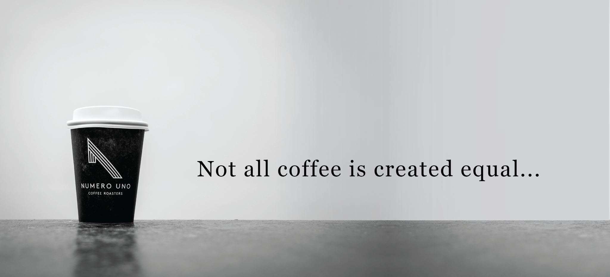
Texture and patterns in the coffee bag also play an important part with the organic nature of the lines creating a down to earth, fun, yet incorruptible feel. The mark itself represents the number “one", giving it a great reference to navigation, site, having purpose and pace. Visually it is a beautiful yet sharp and strong object.
Numero Uno will always see a positive, where some may see a negative, or where others may never dare to go, we’ll go as far, or climb as high as it takes to discover unique coffees.
Our process is the culmination of all our people applying their craft and working to the highest standards at every stage. Together our achievement is Numero Uno